Feeds:
Posts
Comments

Posts Tagged ‘infographics’

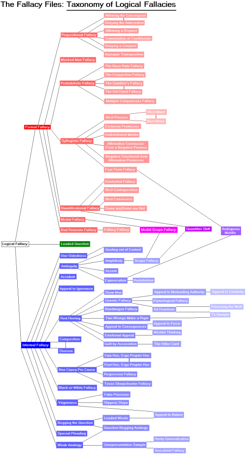
My but these things are popular. This one comes to us via yourlogicalfallacyis.com and is free to download in three sizes. The graphic is also downloadable as vector art for those saavy and motivated enough to want to work with the image some more. In terms of design I think I like this one the best of all those shared on RAIL so far. (You can see the others here and here.) It also avoids the tricky business of classification and therefore might be more useful for teaching purposes. Below is a (crummy) screenshot. The files available for download are much higher quality.

Who are those three chaps in the middle there?

It is interesting that the fallacies seem to be bubbling up as a meme in the culture at large like this. I wonder if it’s a sign of sorts that people have had enough of the shoddy, transparently shortsighted and self-interested discourse that has come to characterize so much of public life and are starting to crave discourse of a different kind–perhaps more rational, thoughtful, and careful.  That would be nice…and timely too.

Read Full Post »

Readers of RAIL might remember this chestnut from two years ago on infographics and visual argument.  That post featured a TED talk by David McCandless. Though I’m tempted, I’ll refuse to commit the post hoc ergo propter hoc fallacy here and simply report that McCandless’s website, Information is Beautiful, now features a very nice-looking infographic on the fallacies, (oddly) titled Rhetological Fallacies.  Clicking on the thumbnail below will take you to the full version at its home site.

Read Full Post »

Here’s a lovely graphical representation of the family of fallacies via The Fallacy Files. (Note: I found out about this infographic first via the Philosorapters blog, which gives advice on job hunting mostly but also occasionally on teaching philosophy.) I think many readers of RAIL will find this way of cutting the cake rather interesting, as the classification of some fallacies is…let’s say novel.  Others represented here are altogether new to me (e.g. the “Texas Sharpshooter”).

Whatever one makes of it, you have to tip your cap to the work that no doubt went into putting this concept map together. I’d love to see some alternatives.  Anyone out there up for it?

I'm a sucker for a nice infographic!

Read Full Post »

%d bloggers like this: